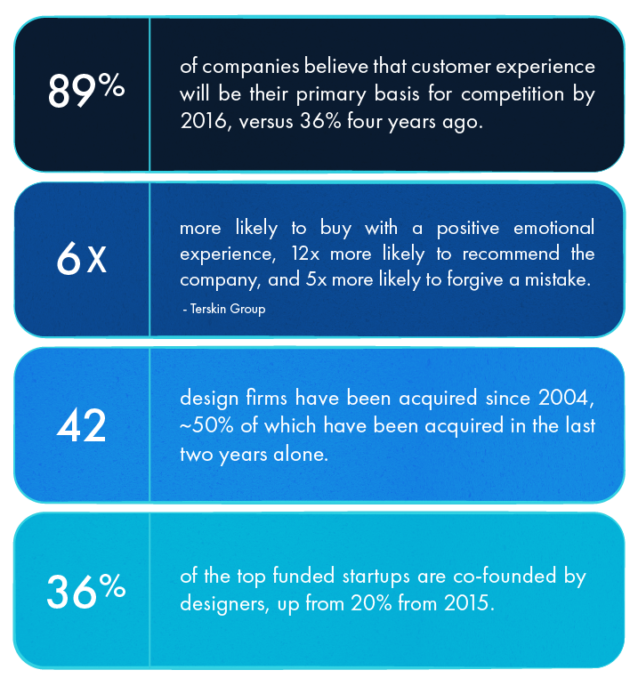
About 50% of all design firms sold in the last ten years were acquired in the last 24 months. And they weren’t bought by Amazon or Facebook or Google. They were bought by the banks and consulting firms — the BIG financial institutions. These organizations don’t have the most innovative reputations (after all, they’re referred to as “laggards”), so when even these companies are adopting design firms it says something drastic. It says: design should be a product priority.
Design is a specialized skill, and as a PM, it can be intimidating — especially if it’s not your natural inclination.
Having spent most of my career as a product manager, I’ve stated clearly — and to a lot of pushback — that design should always be a priority for product managers. Design is a specialized skill, and as a PM, it can be intimidating — especially if it’s not your natural inclination. (Plus, there’s usually a design team to deal with that stuff, right?) But that mentality is a missed opportunity; it’s equally important for PMs to keep design top-of-mind when making decisions.
Product design was one of our key differentiators when we founded Roadmunk. We didn’t necessarily have the data to back up that decision at the time. But look at these new statistics and tell me design isn’t rising in importance.
There are seven product design principles that I believe all product managers should follow. Blending my first-hand experience and observations, these are the essential design principles that I think every product manager must internalize and evangelize — especially if design is not your forté.
1. Tell users what to think
This first principle is an evolutionary design concept from engineer Steve Krug. It states that when designing, we should listen to our users’ needs to the point that we know and tell them what they should be thinking. Basically, you should understand your users’ workflow so much so that you can determine what they’re attempting to do. (Like an *actually* perceptive fortune teller!)
This example might help you visualize what I mean. Below, you’ll see flight search engine Kayak. It’s really well-designed, simple and easy to use. The problem, though: I’m not sure where exactly to focus.
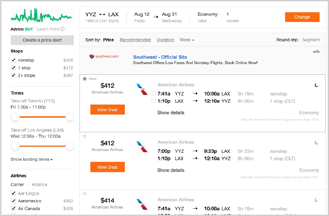
While the UI is fantastic (the important things stand out, like the calls to actions and filters), I can’t confidently say the same for the user experience — which is just as critical as the UI. I see way too much competition between the various colors, equal priority given to all the filters, multiple lines of information in each section… It’s a lot.
Enter Google Flights. On an aesthetic level it doesn’t compare to the best websites you’ve ever seen — let alone Kayak — but they’ve done a really important thing: they’ve established the priority in which they want you to think about things.
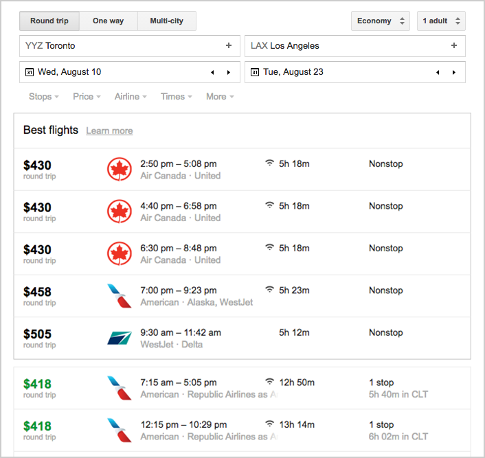
Price is a big influencer for you? Awesome — here are the lower prices first.
Airlines and WiFi are deal breakers? Okay then, here’s that information upfront.
They’ve taken into account what they already know about their users and told them, “This is what we know you want.”
Google Flights is showing what matters. They’ve reduced the clutter by honing in on the key user needs and hiding/putting aside the other features. The filters are all still there; they’re just greyed out or lightened to improve the user experience. This to me is a great example of a company knowing their users and empathizing with them thoughtfully.
2. Minimize cognitive load
A basic but easily overlooked concept is that a user experience should be simple; your design should make the user think as little as possible. “That’s got too much cognitive load” is probably a phrase you’ve heard from almost every product designer ever. Okay, that might be an exaggeration, but the term cognitive load has become a keeper in the PM and design space. It’s a fancy way to say “cut the clutter.”
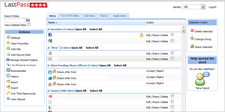
Let’s take the below example of an early version of the password program LastPass. I use this program all the time for its super-practical functionality, but looking at this early design, I’m overwhelmed for many reasons. For example:
- There is no focal point. Where the hell do I even start?
- Almost every button has the same degree of importance. Since when do edit, share and delete have the same weight as a user manual?!
- The icon colours don’t match at all. Like at all.
Compare this version to the site’s latest design and you’ll notice a huge improvement. They’ve designed for the user’s core action of searching for a program-specific password to change, edit or delete. So that means:
- Brand logos were expanded and put front and center
- A hover effect was added to each brand for the secondary options (edit, delete, etc.)
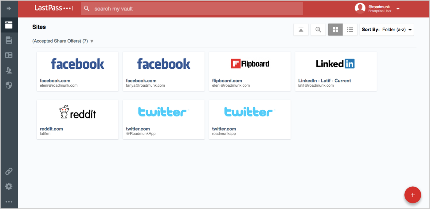
While the design may look significantly different, it was fueled by simple tweaks that drastically reduced the thinking on the user’s part and provided a cleaner emotional experience.
3. Three-click mentality
Simple exercise for you. Pick a website or app you love and see how many clicks it takes to get to a core action. Users don’t want to click on endless buttons to reach their destination; they want short and sweet. One core design principle PMs should internalize is that every single core action should be achievable within 3 clicks. Granted, not every application can do this, but this is a great opportunity to challenge yourself.
Let’s take Amazon. It’s a huge site. Imagine I bought something, I really love it, and now I want to tell the seller how I feel. How many clicks would it take to complete that task? Let’s see!
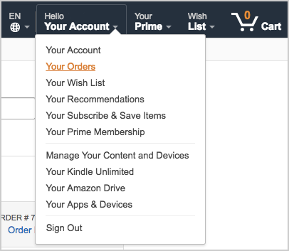
Step 1: ‘Your Account’ would be the natural first step to view past purchases. I hover over it — which we’ll consider half a click.
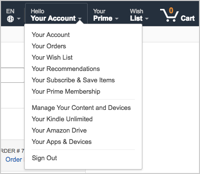
Step 2: Click on ‘Your Orders.’
Step 3: Scroll down the list and click on “Write a product review.”
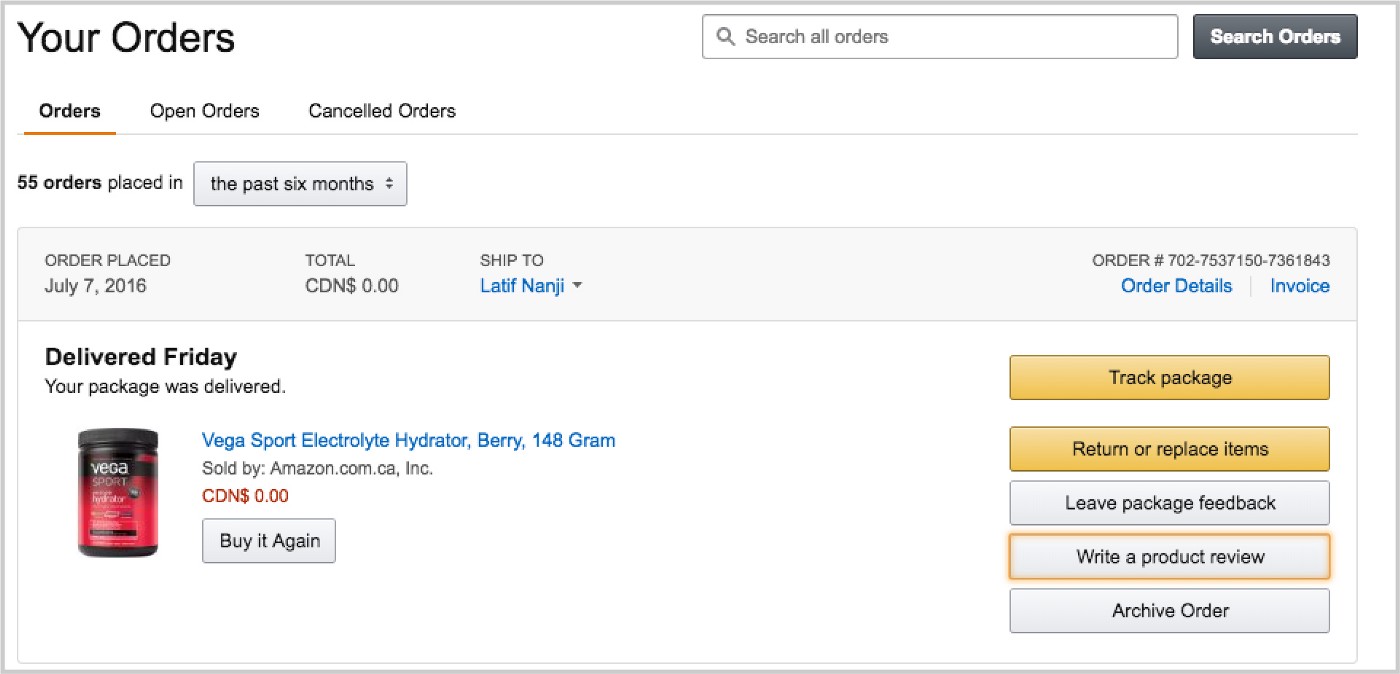
Done. In 2.5 clicks I’ve reached my destination and can perform my core action. Despite being one of the biggest websites in the world, Amazon has taken into serious consideration how to streamline my user process.
Again, I understand this isn’t always possible, but I think the 3-click mentality can serve as a litmus test to see how friendly your application really is.
4. Reversible design
We all make mistakes — which is why product people designed the Undo button. Users can get pissedwhen they can’t undo an action (I’ve been there!). Yet so many of the products in market still don’t offer reversible options for certain actions.
Reversible design is more than simply clicking an undo button. Here are some examples of reversible designs from the tools I use every day:
-
The little ‘x’ that lets me delete a filter on Intercom
-
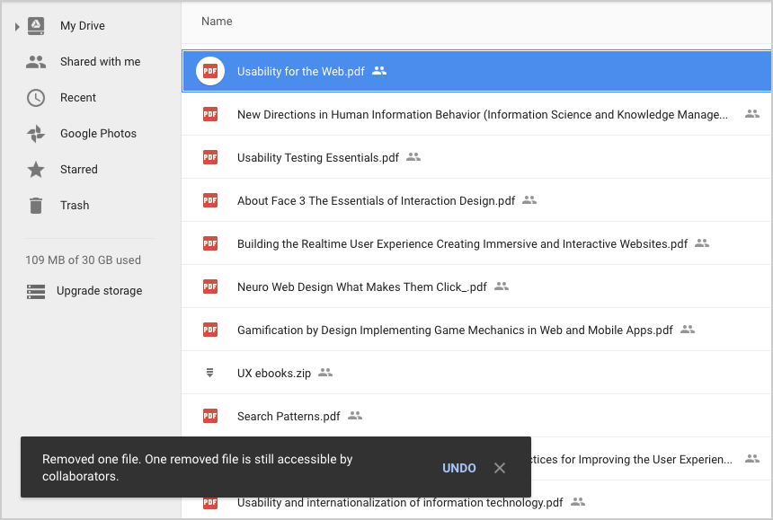
Deleting or removing files from Google Drive
-
Moving a Trello card — then being able to drag it back to its original place
If your support center is frequently inundated by questions from users who have lost files or accidentally changed work they didn’t actually want to change, you’re probably going to want to give them a way to backtrack. Where would we be without Command+Z?
5. Use verbs with context
If your dialogue boxes are bogged down with words like Yes, No, Cancel and Save, your users might be a little muddled. This vague terminology only increases cognitive load. Half the time you’re not sure you’re taking the right action, prolonging a process that should have taken little thought and even less time.
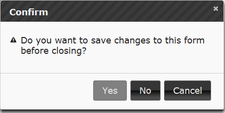
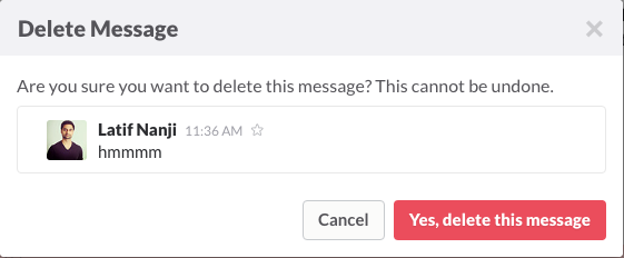
Skilled designers have now narrowed down the options and provided context. Instead of a bevy of vague button choices, you get specific instructions: verbs/phrases like Cancel or Yes, delete this message. Simple. And on top of that, you get context telling you why these verbs are here (e.g. deleting the highlighted message). Already you’ve reduced ambiguity and cognitive load.
Sometimes it really comes down to something as easy as changing the text on the screen to significantly improve a user’s experience.
6. White space is your friend (a.k.a. Use white space to disrupt your competitors)
This dead-simple design principle can elevate your design from clunky to slick. When done well, it really eases the emotional experience for users. Designers tout this principle a lot, but there is still often a struggle to integrate the concept of white space.
Take a look at WordPress. Yes, everything you see on this screen is something you’ll need to use at some point in the blogging process. But when you’re actually writing (i.e. performing the software’s core activity), this UI is very disruptive. It comes off as heavy and messy. Only 25% of the real estate is allocated to the white space for writing.
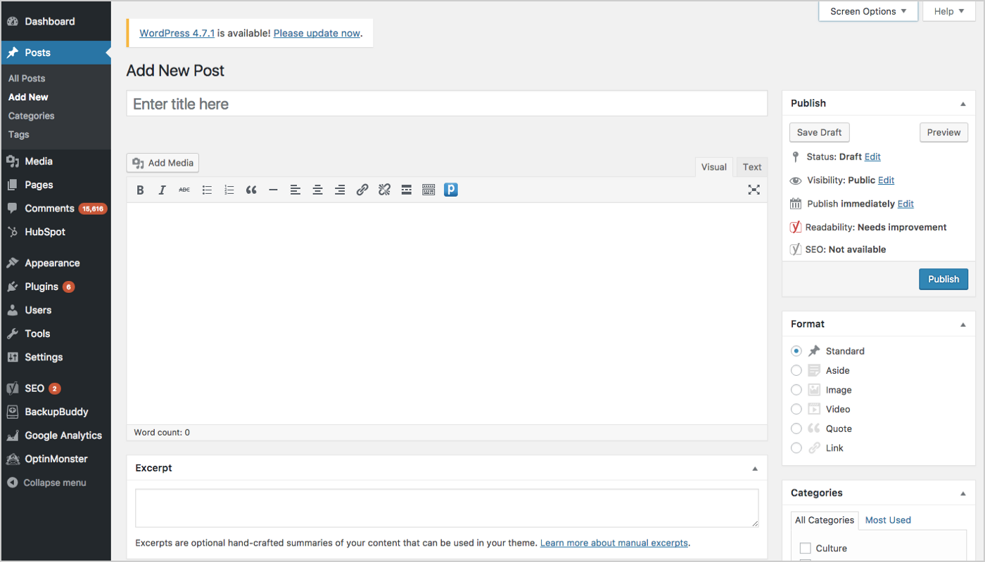
The site has caught on to this criticism by providing a “Distraction-free writing mode” (the small button at the far right of the text editing toolbar) in their latest versions. Temporarily removing all the sidebars, this mode puts the writing space/white space as the central focus of the page.
Compare this to Medium, which has always been pretty much just white space. It provides a space to write your post, then add social widgets, type some tags and publish. Essentially they’ve made the process much easier for someone who might be jarred by WordPress or similar publishing platforms. And it hasn’t reduced functionality!
7. Design in MSP (Minimum Saleable Product)
So far, I’ve mentioned common design principles you’ll hear as a PM, but a less-talked-about principle is having your team design in MSP (minimum saleable product).
I stay away from language like MVP (minimum viable product) — unless it’s an infrastructure-related product — because to me that ignores user experience. It puts it as this far-off goal…a “nice-to-have” rather than a “must-have.”
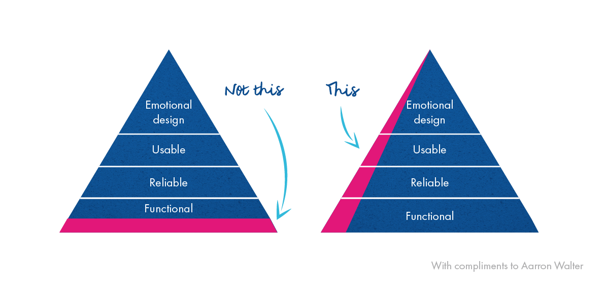
Take the image below. The pyramid on the left shows that designing in MVP starts from the bottom (i.e. the pink) and works its way up the pyramid addressing emotional design as the last “need” of the product. Whereas on the right, you see that designing in MSP tackles all the “needs” in the pyramid — including emotional design — simultaneously from the start (i.e. why the pink component covers the entire height of the pyramid).
MVPs encourage teams to get something out there that is functional. It can break, but as long as the functionality and workflow are available, it’s solid. That, to me, is a “no.” What about the usability? Or emotional connection?
Think about any product you’ve ever encountered. When you first enter an application or product, you have an emotional reaction based on the design alone, which either does or does not spur you to click around and see if it’s usable. A product’s design is the first thing a user acknowledges before anything else; it’s the first impression.
A product’s design is the first thing a user acknowledges before anything else; it’s the first impression.
Yes, the product needs to be functional, but my sales team also needs to be able to sell to users. And not just to the early adopters and innovators: we need to sell this to the early majority. If these terms are unfamiliar, check out the Technology Adoption Lifecycle Model below. The model includes five stages of how a product gets adopted and the different customer segments within each stage.
In his hugely popular 1991 book Crossing the Chasm, author Geoffrey Moore explained that for products to be successful, they must cross a chasm that exists between early adopters and the majority of the market.
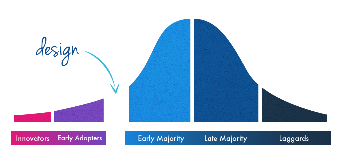
Crossing the chasm is difficult, since the early majority is vastly different (i.e. pickier) than the first two groups, who are more willing to put up with bugs and reliability issues. The way we cross the chasm is through designing an MSP. How? Because pickier audiences in the early majority will overlook faults that may exist when you offer a product with superior design elements.
…the more you focus on packaging saleable features with compelling, user-friendly design, the more disruptive you can be to the market.
Take my team at Roadmunk, which focuses on UX and users’ emotional responses. We find that our users aren’t gathering their pitchforks and starting a manhunt when there’s an issue, because we’ve designed in MSP to ensure that our app is kinda really pretty (#shamelessselfpromotion). Don’t get me wrong, functionality is still key, but the more you focus on packaging saleable features with compelling, user-friendly design, the more disruptive you can be to the market. For example, our customizable template library is one such saleable functionality that’s hit the mark with our users largely due to its user-friendliness and design focus.
Final words: Let design be your secret weapon
Design has become more and more of a priority at product organizations, and it can be your secret weapon for standing out in a sea of competitors and changing the market. It doesn’t matter whether you’re working with your first prototype or the thousandth iteration of your product, your product’s design should always be on your mind.
Don’t just leave design in the hands of your design team; PMs should be living and breathing it, too. Take the time to put design at the forefront of your product strategy and see how your users become emotionally invested.
This article was originally published on Medium, Jun 5, 2018.